

Why a real estate website should walk buyers through the project like a broker would
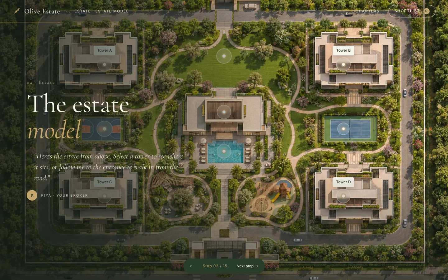
A buyer standing in your sales office does not ask for a PDF. They ask to be shown around. A good broker starts with the estate model, points out where the towers sit, walks them past the garden and pool, takes the lift up, and ends on the balcony of the home they are considering. By the end, the buyer can picture living there.
Most real estate websites do the opposite. They open with a banner, a list of configurations and a price table, and leave the visitor to assemble the story on their own. Many leave before they do.
What a walkthrough website does differently
A walkthrough site turns the page scroll into the site visit. Each step of the scroll is one stop on the tour:
- The estate model. Show the whole project first so the buyer understands the layout and the location of every tower.
- The amenities. Garden, pool and clubhouse, each with its own moment, instead of a thumbnail grid.
- The building and the lift. Moving up through the tower gives a natural way to introduce floors and views.
- The home itself. Interior and balcony views, so the buyer sees what their own floor would look like.
- The shortlist. Buyers save the homes they like and send them to the broker in one step.
We built exactly this for Olive Estate, a residential project. The site walks a buyer from the estate model to the balcony of a home, then lets them shortlist homes and request a visit.
Why it converts better than a brochure
A visitor who has been taken through the project is further along in their decision than one who has skimmed a price list. Three things change:
- They stay longer, because each scroll reveals something new rather than repeating the same page.
- They ask better questions. A buyer who has seen the balcony view asks about that floor, not whether a visit is possible.
- The visit request carries context. The shortlist tells the broker which homes the buyer actually liked, so the first call is a conversation about specific homes.
Keep it fast and mobile-first
Most property searches start on a phone. A walkthrough has to load quickly and work with a thumb. That means compressed images, no heavy video on first load, and tour stops that make sense in a single column. We design the mobile version first and treat the desktop version as the wide edition.
Make it editable
The tour should never be frozen. Prices change, towers open, and new homes launch. The site needs a back office where the sales team can update availability and pricing without calling a developer. Read more about what that back office should do in our guide to real estate back offices.
Where to start
Begin with the story, not the screens. Write down the five stops you take a buyer through on a site visit, in order. That list is your website's structure. If you want help turning it into a site, start a project and we will walk you through the process.